
Kupinskiy Architects
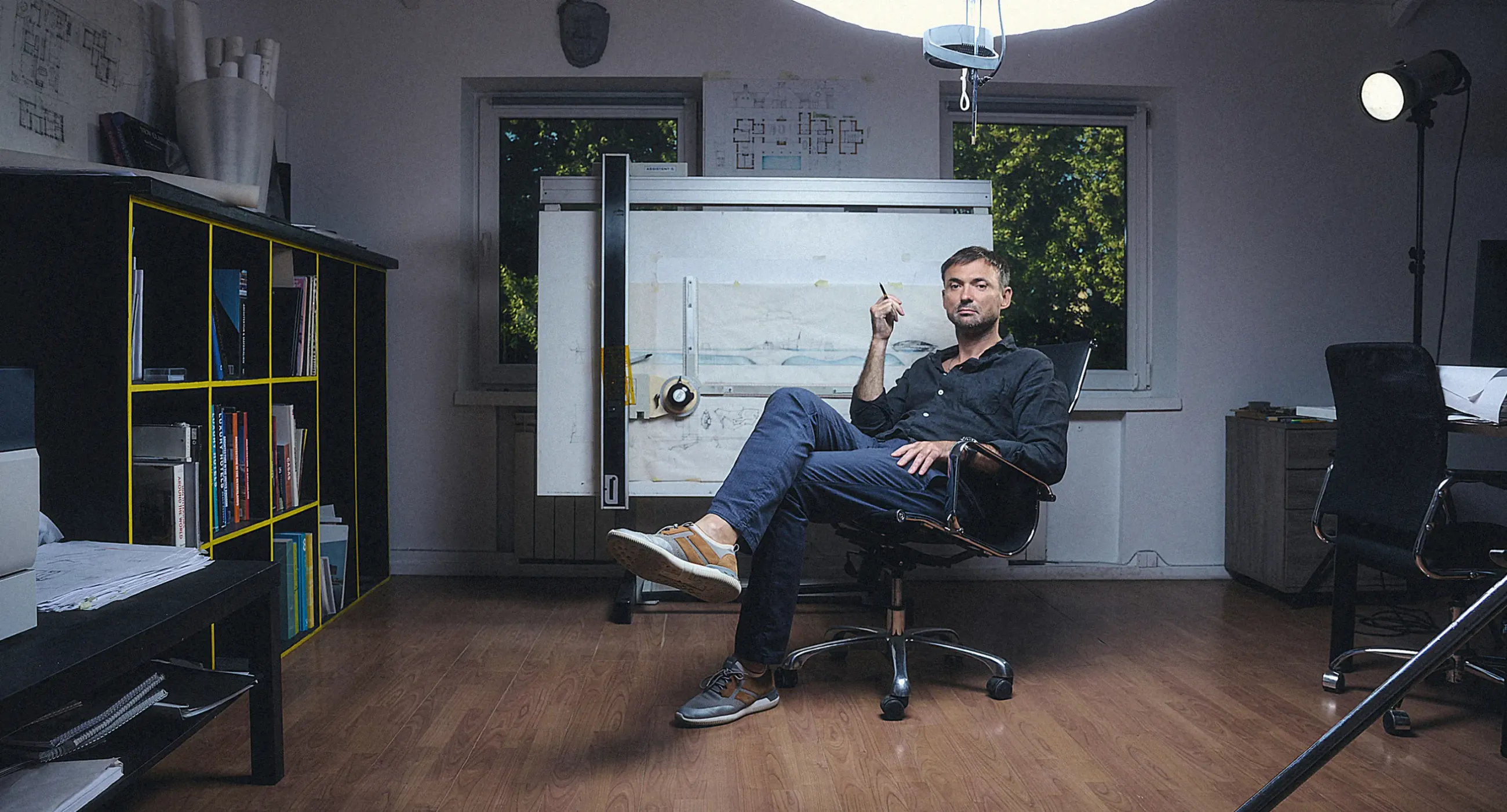

A full rebranding, an architecture of meaning and a vision for an author-led, full-cycle architecture studio. A resilience strategy for extremely difficult times.
Context and challenge
Our story with KUPINSKIY ARCHITECTS spans almost two decades. We first worked together back in 2007, when the studio was still called “Kupinskiy & Partners”. The company came through its early stage well, but years of working on its own and inconsistent attempts to update its style had worn down the brand’s visual capital. The business kept growing, while its public image became weak and outdated and no longer reflected the real level and scale of its projects. To help the studio reach a new market level, we offered to work together again, run an audit and fully relaunch the brand.

The main challenge lay in the nature of the business. It is a boutique, author-led, full-cycle architecture studio: its success, philosophy and expertise rest on the founder, who is both its ideological leader and the author of all its landmark projects. We had to assess the prospects for scaling, highlight the strengths of a deeply personal approach, show the value of managing projects from the first sketch to handing over the keys — and build a strong bridge between the architect’s personal brand and the company as a corporate asset.
Transformation
The transformation took shape through a series of in-depth strategy sessions, brainstorms and interviews. Instead of template solutions, we distilled the studio’s true DNA, inseparable from the founder’s charisma, worldview and uncompromising philosophy. The result was a renewed, concise brand platform: KUPINSKIY ARCHITECTS. We set a strong direction for communication, with the uncompromising “authenticity” of architectural form and professional duty as its core message.
[pair-img]
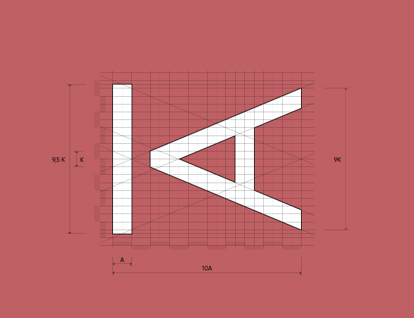

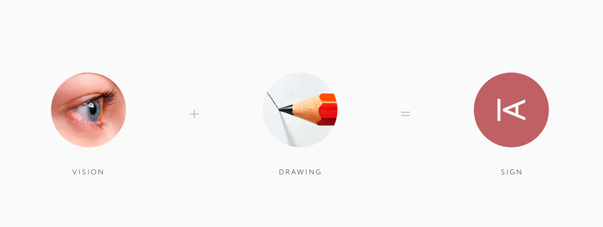
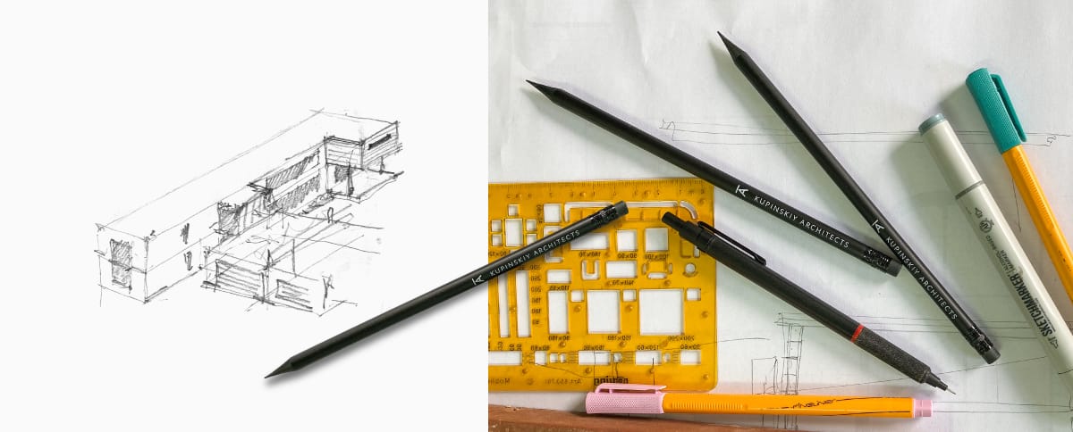
The central element of the renewed philosophy is the brand mark. It captures the magic of creation — the moment when the architect catches the first glimpse of a future building. That impulse, when inspiration makes you sketch a vision in pencil on the nearest scrap of paper, became the basis of the concept. The touch of a pencil on paper lives in the minimalist geometry of the new mark, which combines the author’s initials. The identity received a refined, restrained palette of Italian terracotta shades and deep graphite, and covers every touchpoint — from a branded sketching tool to premium drawing albums, façade signage and a modern portfolio website.
Results
The result is a living, coherent and strategically protected architecture brand that speaks confidently to ambitious clients. We built a unique positioning system and key messages that clearly convey the maturity and scale of the studio’s work.
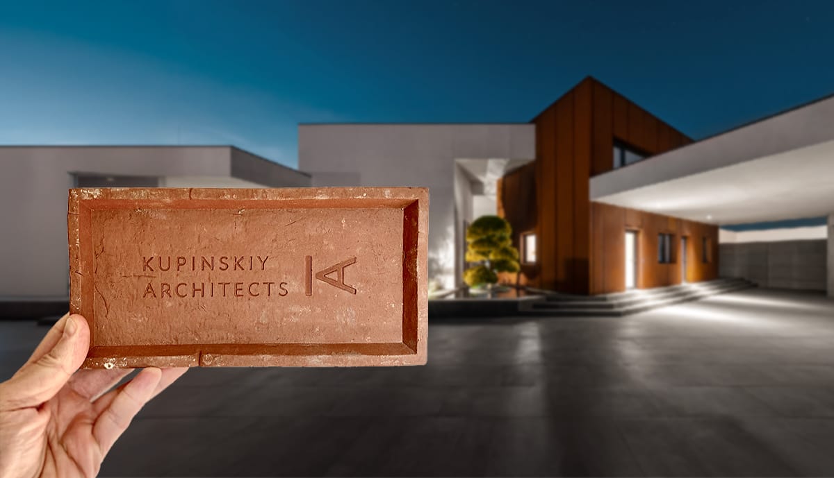
The work was completed, and the renewed platform launched, just as russia’s full-scale invasion of Ukraine began. The construction market froze, and most architecture firms struggled with cash gaps and a lack of orders. In these extremely difficult times, the renewed brand gave the studio the impulse it needed to stay resilient and grow. A clear strategy, new positioning and a strong personal website brought new clients as early as 2022–2023. The transformation did more than save the business from market collapse: it turned the crisis into a new stage of development, let the company build confidently on its experience and laid a solid foundation for entering the international market.
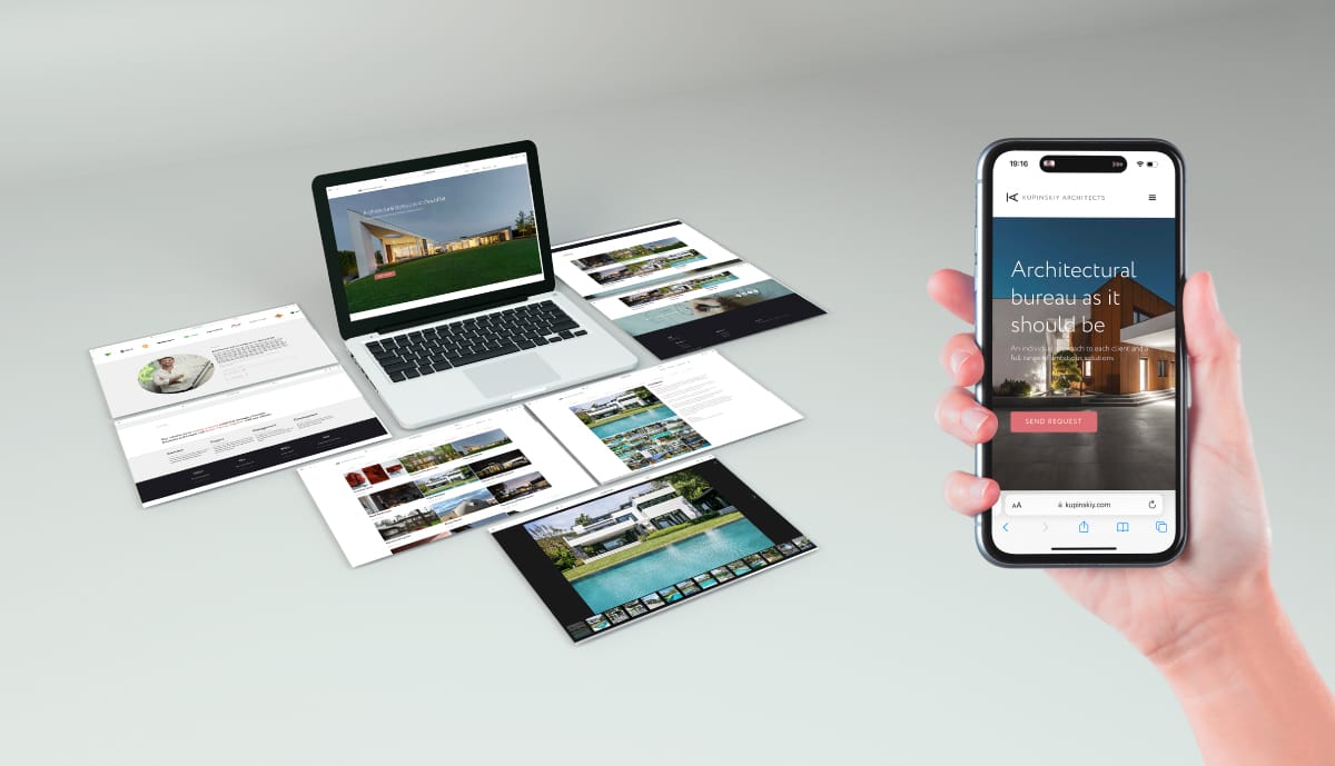
Please note: this case — a comprehensive rebranding for an author-led architecture studio — is presented in brief, to show the overall context. The full communication strategy, differentiation tools and portfolio contain unique insights that we are ready to share in person.
Send us a request, and at a personal meeting we will walk you through this case and look at the architecture and growth potential of your own brand.
FAQ
A portfolio shows what you can do, while a brand explains why you are the one to choose. A client buys not only a project but also trust in the person who will lead it for years. A coherent brand makes your philosophy, approach and level of work clear even before the first meeting, so you attract clients who already share your vision.
When a studio rests on its author, the brand should not hide their personality, but it cannot depend on it entirely either. We build a bridge between the two: the founder’s philosophy and signature style become the basis of the brand platform, and the company gets its own system that can scale. At KUPINSKIY ARCHITECTS the brand mark combined the author’s initials with the image of a first pencil sketch.
The main signal is a gap between the level of your projects and how the studio looks and sounds to the outside world. Years of piecemeal updates, different styles in presentations and on the website, and an outdated name gradually erode a reputation. Rebranding starts with an audit: we determine what is worth keeping and what needs to be rebuilt into a single system.
Yes. In a crisis, clients choose those they trust, and it is the brand that builds that trust. The renewed KUPINSKIY ARCHITECTS platform launched at the start of the full-scale invasion, when the construction market froze, and helped the studio attract new clients as early as 2022–2023. A clear strategy lets you act with confidence instead of waiting for better times.
The KUPINSKIY ARCHITECTS rebranding took 11 months: from the audit, strategy sessions and interviews to the brand platform, identity and portfolio website. The timeline for your studio depends on the scope of work and the speed of approvals. Send us a request, and we will discuss your goals and propose a clear work plan.
Read more

Promin Aerospace