Logo and brand mark: the foundation of visual communication
A business’s visual communication begins with the client’s first glance at your product, signage or social media page. When attention scatters within seconds, a company cannot afford a vague or outdated image. Logo design creates the company’s main visual identifier, conveying its values, character and ambitions. It is an investment in long-term recognition: this symbol will stay with your business through every stage of its growth, building trust and loyalty.
What is a brand logo?
A professional brand logo is the quintessence of a company’s meaning, packed into a concise graphic form. It is not just an attractive picture but a functional business tool. Its main task is to identify the company instantly among hundreds of competitors, evoke the right associations and be remembered from the first contact. Good logo design works as a visual anchor: even without reading the name, the client should understand which product or service they are dealing with.
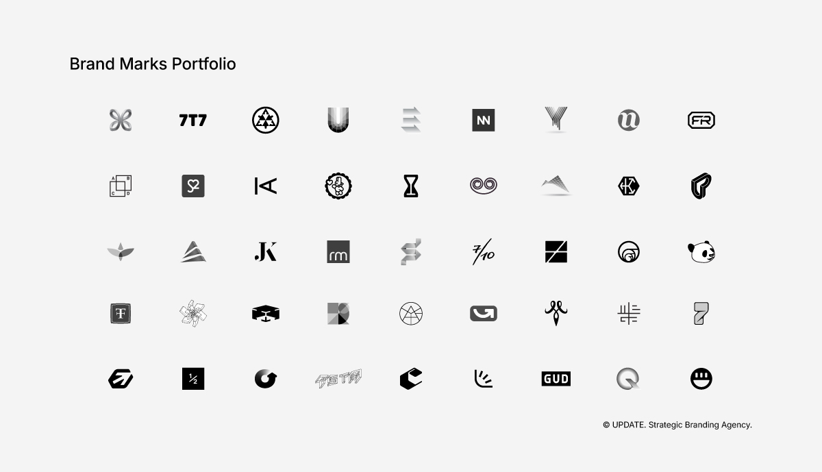
How is a logo different from an identity and a brand mark?
To set the task correctly, it is important to distinguish the basic concepts of visual marketing:
A brand mark is purely the graphic part: a symbol or icon (for example, Apple’s bitten apple or the Nike tick). A brand mark can be used on its own or together with the name in text.
A logo is the unique lettering of the company name, often combined with the brand mark. It can be a purely typographic solution (Sony, for example) or a combined one. Sometimes it is based on a brand monogram — a stylised interlacing of the name’s initial letters.
Brand identity (corporate style) is the broadest concept, a complete visual system. It includes corporate colours, typography, patterns, layout rules and photo style. The logo is only one of its key elements, not the only one.
What does logo design include?
Creating an effective symbol is a multi-stage process that requires not only creativity but also technical precision.
We do not draw at random: we develop a product ready for use in real business conditions.
Developing the concept and sketches. Everything starts with the search for an idea. The logo concept is built on the company’s strategy and positioning. The designer creates working sketches, testing different metaphors and graphic directions. At this stage, clichéd associations are discarded in search of the unique image that precisely conveys the character of the business.
Choosing the typographic and graphic solution. A typeface has its own voice: strictly corporate, playful, premium or technological. We select the typography carefully or create it from scratch. In parallel, we refine the brand mark and check its legibility, proportions and balance with the lettering.
Colour and monochrome versions. Colour evokes emotion, so the palette is chosen with your target audience’s perception in mind. But a professional mark must work not only in colour. Black-and-white (monochrome) and inverted versions are always developed. They are needed to apply the mark correctly to documents, stamps, embossing or laser engraving.
Adapting the logo to different applications. A modern mark must look equally flawless on a huge billboard and on a smartphone screen. An adaptive logo means several layouts: horizontal, vertical, and a reduced version for a website favicon or a social media avatar. We make sure the mark stays legible at any scale.
What does the business get?
By commissioning this service, a company invests in an asset whose value only grows over the years. What you receive is not just a set of files but the solution to specific business tasks.
A recognisable, unique brand mark. You get a symbol that sets you apart on the shelf or in the digital environment. High recognition lowers marketing costs: the faster a client remembers your brand, the less each subsequent contact costs you.
A logo that scales to every format. We create a technically flawless vector logo. Vector graphics can be enlarged to any size without the slightest loss of quality. Even the most complex or minimalist logo will look sharp on any surface.
A basis for further identity development. The approved mark sets the tone for all subsequent visual communication. It becomes the core around which a complete brand book is built, and packaging, office interiors, staff uniforms and advertising materials are designed.
How does logo design work?
Work on the visual image at UPDATE AGENCY is clearly structured, which lets the client control the process and be confident in the result.
Briefing and reference analysis. We start with an in-depth interview to understand your product, the company’s ambitions, the audience and the competitive environment. Together we look at good and bad examples (references) from the market to set a clear stylistic direction and reduce risk.
Developing concepts. Based on the brief, we design several fundamentally different directions. We present each one with a clear explanation of its metaphor, accents and priorities.
Refining the final option. Once the client chooses one of the proposed directions, the polishing stage begins. We make the necessary adjustments, refine the details, fine-tune the kerning (letter spacing) and finalise the colours.
Preparing files and handing over materials. At the final stage we assemble the complete file package. The client receives source files for print and web in all required formats, plus a basic guide (logobook) with rules for using the mark.
Who needs a new logo?
The need to create or update a visual image arises at turning points in a business’s development:
- Start-ups and new companies preparing to enter the market that need a strong initial image.
- Existing businesses whose old mark is outdated and needs a full logo redesign.
- Companies that have changed their field, price category (for example, moving into premium) or positioning strategy.
- Businesses after M&A deals (mergers and acquisitions) that need to unite different assets under a new, shared and powerful symbol.
How much does logo design cost?
Every project is different, so we assess the budget individually. The price of logo design depends on many factors: whether a brand audit is needed first, how many concepts to present (usually 2–3), whether a unique typeface has to be created, and how complex the technical adaptation of the mark is. Keep in mind that you are paying not for time spent drawing lines but for an experienced specialist’s professional thinking, the search for a unique idea and a tool that will earn money for your company for years.
Logo design at UPDATE AGENCY
At UPDATE AGENCY we believe that good design is the visible intelligence of a brand. We do not produce template solutions from stock libraries; we design balanced, deep visual images grounded in strategy. Our team combines an understanding of marketing with impeccable aesthetics, so that your brand is not only noticed but loved. If you need a strong, contemporary and lasting visual identifier, you can commission a logo from us. Together we will go confidently from the first sketch to a final file that you — and not only you — will be proud of.

FAQ
A logo is only one element: the core symbol and the lettering of the name. Identity is the complete set of rules and visual constants (typefaces, colour palette, textures, layout rules, photo style) that defines how every touchpoint between your brand and a client will look, from a business card to an office interior.
We usually develop and present up to 5 fundamentally different conceptual solutions. That is enough to see different directions for the visual image without getting lost in the choice. A clear briefing and a deep understanding of the business narrow the search considerably, so there is no need for dozens of versions that would be discarded in the end.
Logo design at UPDATE AGENCY takes 2–4 weeks on average, from briefing and reference analysis to final files. The timeline depends on many factors and is individual for each case.
The cost depends on several things: the format of our collaboration, your deadlines, how involved and open you are during the briefing, and how complex the graphic solution is (for example, a custom typeface). Versions in other languages and the number of adaptations to different applications and formats matter too.
We usually hand over a complete package of final files in all required formats and colour variants. As standard, these are vector formats (such as AI, EPS, PDF, SVG) and raster formats (PNG, JPG) in CMYK and RGB. By agreement, other colour systems such as PANTONE or RAL are also possible.